Search This Blog

Showing posts with label Chapter. Show all posts

Thursday, May 24, 2007

How to win a photography contest

When it comes to competition, it works like this: As one of the judges, I choose the 10 photographs I like best. For round 1, that meant choosing 10 out of 491 photographs. In other words, for every 50 photos, I can only choose one. Words can’t describe quite how difficult that is: A lot of talent and creativity goes into competition entries, and a lot can be said about.

I won’t lie to you - while I am a moderately successful blogger (hey, you’re reading my blog right now, aren’t you?), a soon-to-be-published author (my book goes on sale in about a month and a half) and a washed-up freelance / stock photographer who decided that I could only do photography as a hobby, because doing it for the money was soul-destroying - I have never actually judged a competition before. While the guys at Crestock were quite helpful in offering guidelines and ideas as to what I should be looking for, it got me a-thinking: What can you, as a photographer, do to maximise your chances in the battle of shutter times and lighting, against the rest of the pack?

A quick disclaimer: I’m writing this before I’ve seen who the winners are of round 1, and as such, some of the ideas and thoughts below might be completely contradicting the people who actually won. On the other hand, there are 13 judges, each with 10+1 vote, so in theory, 143 votes could be cast. On my own, I have very little (well, a thirteenth, or about 7.7%) influence on the final decision.

It’s also worth noting that everything in this posts are merely my own opinions, and for all I know I might be the rank outsider: All the other photo judges in the world might very well disagree with me.

1 - Stick to the topic

First off, you would be amazed how many people submit photos that don’t actually fall within the area of the competition. To use a concrete example: In the 1st round of the Crestock competition, the title of the photo was to be ‘The Meaning of Life’. Now, I’m all for having a wide array of possibilities and interpretations, but there’s something to be said for at least tenuously staying on target.

Take the image shown at the bottom, for example (check out the much bigger version over at Crestock).


On its own, it’s a pretty good photo: It’s okay lit, and from my days of LAN parties, I can totally see how caffeine-laden drinks and computer keyboards can be part of the meaning of life.

What you have to remember, however, is that a lot of the judging that is done is based on people’s own experiences: To most people, the meaning of life will not involve a can of Dr Pepper, and while I imagine it could successfully be argued that it might be the meaning of life to some, that is an ascertation which would fill the viewer with sadness.

The closer you manage to stick to the target, the better. It doesn’t matter if it’s an illustration (a pair of lovers, as in ‘the meaning of life is love’) or a more abstract take on the subject (a beach chair in sunset, as in ‘the meaning of life is to relax’). Making the audience (in this case, the judges) think about what they are looking at is great, but don’t push it too far.


In the photo shown above, for example, with the lady with the red hair (see a bigger version here), initially seems to be way off target: What does a middle-aged woman with bright hair have to do with the meaning of life? But at the same time, the photo sent me into a train of thought: Of course it makes sense. She’s ascending. She’s on a journey. She’s going somewhere. And she doesn’t care about the rest of the world. Hell, that’s as good a meaning of life as I’ve ever heard of…

2 - Know the rules - then break them

Ansel Adams, seen by many as one of the greatest photographers to have ever lived, said something along the lines of ‘there are no rules for great pictures, there are just great pictures’. What he meant by that? Beats me, but it sounds good, no? Okay, just kidding. What I think he meant is that there’s no way to create a set of criteria which guarantee a good photo. Photography is viciously subjective, and ultimately your audience will think what they want. Take the rule of thirds, for example (as discussed here, and in more detail here): It isn’t an iron-fast rule in itself, but people who don’t understand it, break it in ways that are un-pleasing to the eye.


The trick is to do something that works. In my experience, this means that you have to know all the ‘rules’ of photography (Get the exposure right, mind your backgrounds, have a vision, and get it all to work together), so you can choose which ones you want to break for a particular photo. Take the photo up there (I am, right now, pointing in vain at the photo, realising that you can’t see me point. Hmm. I can see this might be a problem. Try here for a bigger version, either way), with the person walking on the train lines. Composition-wise, I would have done this photo very differently indeed. Barefoot might have been better. Throwing the rails off-centre would have helped. And yet, the pale colours, the reflection, and the notion of travelling somewhere by walking on trainlines somehow resounds strongly with me. It’s not the done thing. It breaks with rules and regulations, and it’s awesome. Just like this photo.

3 - Keep it simple

When submitting a photo to a photography competition, it’s tempting to select a photo you’re particularly proud of, or one that shows off a vast amount of different things at once. That’s not necessarily the best strategy. Remember that what you’re trying to do is to a) stand out from the masses of other photos and b) tell a story.

Photography is very much about telling stories, and while you are using a visual medium to do so, you still need to be a good storyteller, and have an eye for what appeals to people.

I guess it says something about me as a person, but here’s yet another of the competition entries below (higher res here) that spoke to me strongly: The simplicity of this image: a couple walking towards the sunset on a road reflecting the light of the golden hour makes this photograph stand out strongly.


4 - Tell a powerful story


As always said in J-school: If it has a human element people can identify with, the story is far stronger. That’s why newspapers after a disaster will tell the story of Mr. and Mrs Smith and their individual tragedy, rather than the much drier factoid that 300 people died: We need to be able to feel that the people involved are related (or at least relevant) to us in one way or another. The best photographs, in my opinion, do the same thing. It doesn’t have to be a tabloid story of murder, deceit, or deception, but if you manage to get an emotion in there somehow, you’re onto something.

There are several levels of involving your audience emotionally. At the most shallow level, there is a recognition of emotion: A photo of a mother looking at a child might invoke this: You might feel that the mother loves the child, but the photo could leave you cold. Another photo would cause you to feel with the mother: Where you understand the feeling at a deeper degree. Finally, an image might be so strong that not only do you recognise and understand the emotion, you might actually feel the same.

The photo of the lovers in black and white, above, for example, works strongly for me at all levels. I recognise it as passion, I sympathise with the people in the photo, and I empathise strongly, in that this particular photo (not really safe for work, but look at the bigger version if nobody can see your screen anyway!), with the feeling of pure, unbridled love and passion.


Similarly, I am affected by the photo of the young woman above. The image (bigger here) is titled ‘religion’, and while I’m not a religious person in the slightest, I recognise it as a powerful ‘meaning of life’ force driving many people. It helps that the photo has a beautiful girl in it and is cleverly captured. The same photograph could easily have been slanted in the opposite direction, with a mosque towering over the same model as an imposing, powerful overlord. The fact that the lady is much bigger than the spire representing ‘religion’ speaks to me, in that the human element is far more important than religion: Religion is built up of people. This interplay of symbolism, great photographic skill and tangential on-target-ism means that this photo definitely deserved one of my points.


A final example of the same is the photo of big feet / little feet (bigger here). The pure simplicity of using two pairs of feet as a symbol of family, love, and a meaning of life? Sheer brilliance.

5 - Technical perfection in pair with strong vision


As you may have guessed from the name of this website, I love doing photo criticisms. I’m a right opinionated little bastard, in fact, and some times, people disagree. A while back, I had a vicious argument with someone over a photograph which was - objectively - technically superior. His strongest argument was that I should ‘look past the technical imperfections, and see how beautiful the model was’. Love makes blind, but you can’t afford to be blind about photos you are going to submit to photographic competitions: You’ll be up against some brilliant photographers (like SUBA, who captured the intensely likeable photo of the laughing girl to the left - check out the bigger version, too!), and even small slip-ups will cost you enough points to lose you a competitions.
The thing is, creativity and originality can make up for some things, but there’s only so much I’d be willing to forgive. A slight over-exposure on an extremely good, unrepeatable action photo? I can forgive that. Not getting the focus right on a studio shot? Not good enough. Go back, learn from your mistakes, try it again.

As a camera operator, you are a technician. Photography, in many ways, is pure physics. Optics, to be exact, but physics nonetheless. As with everything in optics, everything can be calculated. Exposures, refractive indexes, focal distances: Everything can be described mathematically. With modern cameras, you don’t have to worry about much of it, but nonetheless, you still need to get it right.

The analogy is often drawn as such: A snapper that is technically perfect but lacks vision will never be a great photographer. You can imitate, but not learn true photographic vision. On the other hand, having a great vision of what makes a good photo is not an excuse not to acquire the technical skills you need to express your ideas.

In my opinion, all arts are the same: As an artist, you need a message (ideas, vision, originality, inspiration) and a means to express this message. It doesn’t matter if you use a keyboard (poetry, prose), a paint brush (watercolours, oils) or a photo camera (polaroid, pinhole, SLR): If your means of expressing your message aren’t up to scratch, your art simply isn’t good enough.


When it all comes together, you end up with photos like the person laying down in the hallway, above (bigger here).

6 - The X factor

So, you’ve worked hard, and everything seems to be coming together. You’re on topic, you’ve carefully chosen which rules to break, your photo isn’t over the top, you’ve got a story to tell, and your technical skills are as sharp as they come. What could possibly go wrong?

The final thing you need to keep in mind is that you’re up against hundreds of other photographs. If you submit a photo that is similar to what other photographers have done, you both lose impact, and will probably both not win the competition. The key is originality.

And yet, even if your photo ticks all the boxes and is refreshingly original, you may find yourself struggling without a bit of X-factor: That special, invisible ingredient which will transform your photographs from very, very good to ‘Wow, this is simply amazing’.

To me, in this round, the photo to the right does all that, and more. To try and explain why, let me walk you through the process:

When I think about the meaning of life, I think about many different things. Independence is a strong part of it, as is the idea of travel, of being on a journey through life. Love is important, as is loyalty, passion, and a sense that ‘if you’re happy, you need nothing else’. It was something that struck me when I last visited the Caribbean: Many of the people I met had little except each other, but seemed to be the most relaxed, lovely, and happy people ever.


The photograph of the hobo and his dog (check out the full-size version) is right on the money in all of those things: Homeless? Maybe, but the guy seems happy, he’s got a dog he loves, and he knows that it could be a lot worse than spending a day in the sunshine with his guitar. Compounded by the message, this photo is technically superior: The strong greens and blues of the grass and sky, the heavy shadows on the dog and the man, the way the sun catches his beard - it all comes together perfectly.

And the final tip… Develop your own style

There are a lot of fantastic photos out there, and a myriad of tutorials for how you can recreate them, but that’s only half the story: you have to take something and make it your own. Think of it as cooking a new dish: Do you follow the recipe perfectly, or are you confident enough in the kitchen to use it as a base, and remove some things, and add others? If you’re doing the latter, then you’re probably doing the right thing…

Good luck!

- photocritic[dot]org

The IconBuffet Story... Trading Icons


So here's the deal... a few years back we launched the original IconBuffet. At the time we sold stock icons to web designers and other geeky folks all over the world. After a while we figured it would be totally sweet to give away free icons every month to IconBuffet members. Only there's a little twist... not everyone gets the same icons. So you have to swap icons with your friends to get them all. Kinda like baseball cards. Only you can use them on your website.

Then this crazy thing happened... tons of people came to IconBuffet, and this huge IconBuffet community started to grow. Since then we've done a lot of work to make the Buffet better, friendlier, and easier to use. We still do stock icons, but now we're more about our growing community of friends.

Today the Chefs at IconBuffet painstakingly create dozens of new free icons each month which are somewhat randomly delivered to our members according to super-secret schedules. If you're not already a member, you should really sign up. We hope you enjoy the show!

Southlake Town Square
181 Grand Ave, Suite 206
Southlake, TX 76092


Email: chef@iconbuffet.com

- iconbuffet[dot]com

Wednesday, May 23, 2007

Monday, May 21, 2007

Web 2 Awards 2007


Over 200 Web 2.0 Sites in 41 Categories
Rated, Ranked and Awarded

Our team reviewed hundreds of sites in the Web 2.0 sphere to uncover the best in each of 41 categories. From there, we assembled a team of 25 of the most knowledgeable, well-respected experts in the field to vote on the winners.

-seomoz.org
....................................................
----------------------------------------------------
Link >> CLICK HERE
....................................................
----------------------------------------------------

Wednesday, May 9, 2007

Helvetica at 50


The Helvetica font is celebrating its 50th birthday. You've probably seen it a thousand times today. Why?


At this moment in boardrooms across the globe, captains of industry are leafing through sheet after sheet of typefaces. There are hundreds of choices, but many of these movers and shakers don't take a lot of leafing before plumping for Helvetica.

We live in a world where we are surrounded 24 hours a day by adverts and corporate communications, many in typefaces chosen to subliminally complement the message.


COMPARE MAJOR FONTS

Helvetica and its rivals

Helvetica's message is this: you are going to get to your destination on time; your plane will not crash; your money is safe in our vault; we will not break the package; the paperwork has been filled in; everything is going to be OK.

It is sans serif. There are no wiggly bits at the end of the letters. It has smooth, clean lines, and an unobtrusive geometry that almost suggests it was designed not to stand out.

Lars Mueller is a Helvetica devotee. He has published a book, Helvetica: Homage to a Typeface, and recently donated an original set of lead lettering to a Helvetica exhibition at the Museum of Modern Art in New York.

"It has a modern attitude which lines up with the aesthetic premises of the 1950s and 60s. Helvetica is a corporate typeface, but on the other hand it's the favourite of hairdressers and kebab shops. It is the butter on the bread."

"It also says bland, unadventurous, unambitious"
-Neville Brody, designer


Gap, Orange, Currys, Hoover, Lufthansa, Panasonic, Royal Bank of Scotland, Tupperware, Zanussi. The list of brands that use the Swiss typeface - celebrating its 50th anniversary this year - would fill this page.

"It's durable. It comes from natural design forms. It doesn't have an expression of fashion. It has very clear lines and characters, it looks like a very serious typeface," says Frank Wildenberg, managing director of Linotype, the German firm that owns the font.

The typeface, inspired by the 1896 font Akzidenz Grotesk, was designed by Max Miedinger in 1957 in conjunction with Eduard Hoffmann for the Haas Type Foundry, in Muenchenstein, Switzerland.

As Wildenberg notes, its Swissness is part of the appeal. The land where clocks run meticulously and the streets are spotless carries the kind of cultural resonance that the logo makers and brand masters of the major corporations might like a bit of. For others, its neutrality is a platform for daring design.

The typeface's dominance over the past half-century, cemented by the release of Neue Helvetica in the 1980s, has now inspired a documentary, Helvetica, and exhibitions on both sides of the Atlantic.

Bland uniformity

But not everyone is a Helvetica lover. Type "I hate Helvetica" into Google and there are forums for people who rage at the mindless "corporate chic" of this dominant font. They see it as a vehicle for social conformity through consumerism, shifting product with a great big steam-roller of neutrality.


Clear and simple

Leading graphic designer and typographer Neville Brody, who sparked a spate of Helvetica use with his design for Arena magazine in the 80s, says the typeface represents a safe choice for businesses.

"When people choose Helvetica they want to fit in and look normal. They use Helvetica because they want to be a member of the efficiency club. They want to be a member of modernism. They want to be a member of no personality. It also says bland, unadventurous, unambitious.

"Typefaces control the message. Choice of font dictates what you think about something before you even read the first word. Imagine Shakespeare in large capital drop shadow. Our response would be quite different towards the content."

It's perhaps understandable that corporations don't want to take any typographic risks, bound as they are by the bottom line. Choose a wacky typeface in your logos or advertising, and turnover may suffer. Helvetica, on the other hand, offers clarity and neutrality. When used in adverts, it is a platform for other parts of the message.

Nadine Chahine, who works in sales and marketing for Linotype, advises companies on what font to use.

"If you take a script typeface [with a handwriting-like appearance] and use it as the logo for a bank, there's a problem. You need something reliable - it's where you keep your money. It is not about a fun, personal message.

"It uses subliminal messages so that you get a feeling. All of these different meanings are implied within typefaces."

Hence the font Frutiger is used for airports and European motorway signs, New Johnston is the choice of London Underground, Cooper Black for Easyjet, and Dunkin Donuts bears the unmistakable Frankfurter font.

Default setting

But away from the boardroom, many ordinary computer users follow the same path of choosing fonts that say something about themselves when they send an e-mail or write a letter or CV.

You've probably endorsed Helvetica yourself by using one of its digital clones, the Arial typeface, to write e-mails - perhaps because it's easy to read, because it looks reassuring familiar or because it may be the default font on your system.

Others might use a Courier or a Times New Roman to impart their authority, or choose the cartoonish Comic Sans to go with their Mickey Mouse tie.


It speaks of reliability

And just as with the hegemonic Helvetica, these choices arouse strong feelings. There is a "ban Comic Sans" campaign, which has attempted to get legislation enacted in Canada. In Germany, the battle between typefaces ran alongside the country's turbulent history and struggle for national identity in the 19th and 20th Century.

Black letter Gothic typefaces like Fraktur were alternately endorsed and then banned by the Nazis. Now, despite being most associated outside Germany with footballers' tattoos and covers of heavy metal albums, there is still a group dedicated to its return to common usage.

Helvetica may be the most dominant of the fonts, but it has not squashed the opposition in either advertising or the e-mail. And whether you use it, or choose not to, you are sending out a message.

- By Finlo Rohrer
BBC News Magazine

Tuesday, April 17, 2007

Hierarchy. Use it.

Hierarchy is most easily defined as "any system of persons or things ranked one above another." It was originally used as a word to describe literal rank in government or similar organizations. For example, the King was on top, and everyone else was on the bottom, but in varying degrees of status. In design, hierarchy is very important to understand and use because we, as people, rely upon it to inform ourselves.

In our modern world, there is a ton of information coming at us all at once. Everybody wants to tell us their story or give us a message, and our overwhelmed human minds have adapted to filter out useless crap and retain the stuff that is easy and seemingly more important. So in essence, humanity has its own information air filter that tosses all the "similar" stuff into one pile (marked "ignore") and places the other "bold" stuff in another pile (marked "read this").

As designers, it is our job to understand this tendancy of modern man and work to accomodate it. This is where information hierarchy comes into play. In all designs, there is an item that is most relevant and an item that is least relevant. There is also everything in-between. If all items on a page are created with equal hierarchy, than none of them are noticed. They all look the same, and there is nothing telling the viewer "hey, look here first." Things become a clutter of information, become confusing, and ultimately the viewer feels frustrated and loses attention.

This is why we need hierarchy. We need an item that says "look at me first" and other items that allow that hero item to stand out. They allow it to stand out by assuming the role of being less important; they take one for the team and stand back while the hero shines.

Even if you have 8 items and somebody tells you "there can't be hierarchy because they're all equally important," make one of them bigger anyway. Give one of them more attention. Use it as an introductory item, at the very least in order to start the story of your design. Just use hierarchy. Study it. Master it. Use it to its fullest potential. It's not a difficult concept, but so many people don't understand it or forget to make use of it. If you ignore hierarchy, your design work will fall into that pile of sameness that is marked "ignore."

- Ryan Ford

Monday, April 9, 2007

7 Surefire Tips For Re-Designing A Website

Redesigning isn’t rocket science but it could easily become a huge disaster, leaving your website in a worse state than it was before. You can avoid this with the proper knowhow and planning.

1. Focus On Audience
Make sure the website is easy to use. Keep in mind that a visitor needs to be able to easily navigate through your website to complete the sale. If you’re selling a service, the visitor needs to be able to find the service that they are looking for, find information about it and easily be able to contact you. The best visitor is a returning visitor, so make sure a visitor’s experience is great.

2. Set Goals

A successful redesign takes time, careful planning, and thorough testing. Sometimes you don’t even need to completely redesign your website. It may have an excellent design, but be impossible to navigate through. Remember: if it isn’t broken, don’t fix it. You will need to establish long term goals and short term goals. The short term goals serve to help you work up to the long term goals so that everything can be tested after each short term goal is achieved. The last thing you want is your website’s traffic and/or conversion to decrease. So before you do anything, figure out what is wrong with your website and why are you redesigning it. Is it outdated? Does it have a low conversion rate? Or is it just not ranking well in search engines?

3. Analytics (Tracking) Software
Web Analytics is one of the most important things you should have before you even think about redesigning your website. Analytics software allows you to track your visitor, know where they are going and what they are doing. This will give you the answers to the questions asked earlier. It will give you a reason to redesign your website, whether it is to make your site more search engine friendly or to increase the conversion rate. Google Analytics is now free for everyone. It isn’t very user friendly, but hey…it’s free.

4. Define Technical Goals
Before you even start redesigning, make sure you know what you will need for your new website to work. Will you need to back up daily? Is your existing server going to cut it? What if the server crashes? Can you make changes to the website yourself? What language is my website going to be in? Is it going to need a content management system? Figure out what you will need to redesign your website, how long will it take, and who will be making these changes. This will help you estimate the cost and time for this project.

5. Website’s Future
This is one of the most forgotten steps in redesigning a website. Don’t just think about now, think about the future. This way, the next time you want to update your site, it can be as painless as possible. Also know that your website will need maintenance. If you are selling a product, make sure it is easy for you to add more products in the future and that they have the same design as the rest of the website. If you are selling a service, make sure it is easy to add or change it.

6. Usability Testing
After every step of the redesign have visitors test the usability of your website. Maybe what you thought made the website better, actually made it worse. Test every step of the way to make sure you get the best conversion possible. Make changes to your plan according to your visitor’s reaction. This will not only increase your conversion rate, but increase you returning visitors as well.

7. SEO
Search engine optimization will be what drives traffic to your website. It is important that you research your keywords, optimize your coding (keywords in URL, H1, H2, and in the title, good meta description) and comply with any other search engine guideline. If you are spending all this time and money to redesign your website, you might as well put in a little more time and money (or effort if you are doing it yourself) to have it done right. Be careful to have a proper balance between search engine friendliness and usability. After all, a site with 1000 visitors with a 15 percent conversation rate has the same number of customers as a site with 5000 visitors and 3 percent conversation rate. What’s more important…more customers or more visitors?


- singlegrain dot com

Monday, April 2, 2007

Maintaining Relevance in the Web2.0 Space

The term "web 2.0" is jargon oftentimes utilized as a referential term pointing to the more recent wave of new ideas and concepts online. It is much along the lines of the "information age" being a blanket term for the age of internet technology and information sharing.

With this prevalence of information and increased competition for our online attention, websites must constantly strive to provide services or experiences that make things easier and more enjoyable for us, the common internet user.

There was once a time when people thought that huge technological inventions would constantly change the face of humanity. While this is true in many respects, over the last 1-2 decades the technologies that have really impacted our lives have not been groundbreakingly new, but have instead been efforts of lateral thinking. That is, they have been new uses for already-existing technology.
A fantastic example is Apple's venerable iPod. It's a cliche example, I know, but look at the phenomenon it has caused. It didn't reinvent the wheel at all, but instead took a concept that already exists (digital media playback) and simplified it. Apple removed all of the fluff and clutter that people didn't want, and instead gave them only what they need. They made it damn simple to get media and play the media anywhere they went, and because of this the term "iPod" is almost synonymous with "mp3 player," much like band-aid or kleenex is synonymous with bandage or tissue, respectively.

It is the ease of use, the convenience, the simplicity that now draw our attention in the "web2.0" space, and the websites that do not offer this typically fall by the wayside in place of more successful experiences.

YouTube revolutionized the idea of sharing. Everybody has gone to Youtube and has seen a video from there at least once in their lives. It is unavoidable, because sharing the media you enjoy is so simple and so attractive. We oftentimes come upon YouTube not because we're searching for something, but usually because a friend of ours sent us a link to a video and we checked it out. YouTube has quickly become a source of viral marketing efforts, as well, because marketers (in their infinite wisdom) see the popularity the site has as well as the free usage and think "hey, lets make a really crazy video and put it up there for everybody to share." It doesn't always work, mostly because intentional viral marketing is almost impossible to do. Aside from that point, YouTube's media is easily share-able. Heck, you can even embed videos from YouTube in your own website or blog, thus increasing the power each video has.

Now let us focus our attention upon DeviantART, the site we somehow continue to come back to time after time. Recently, a journal was posted questioning DeviantART's relevance on the internet, pointing out other competing art/media-related websites currently in existence. Some cited that DeviantART still was relevant, citing its huge community, its wealth of artwork, and its extreme popularity. Others decided DeviantART was no longer relevant, citing the implementation of pointless features and the huge delays of seemingly important ones.

I would have to say that both sides are correct. As it stands right now, DeviantART's popularity is at an all-time high. It has more artwork in its databases than all of the other competing sites combined, and its name is almost synonymous with artwork on the web. Its community is unmatched anywhere, as well. Conversely, there are also problems with DeviantART. It can at times be slow due to its huge popularity, the majority of the artwork here on the site is of questionable quality, and the community it holds so dear is in a constant state of flux because many people quickly grow tired of the atmosphere that seems to be nourished here. One also cannot ignore the fact that many of DeviantART's most promising features (groups, chat) are unfinished or buggy, and some of the ones that have been implemented aren't widely-known of or easily accessible (pasties, faq, sharing).

Let me clarify some of the points above with a bit more detail, if I may. Back in 2004, DeviantART began working on a system initially called "party mode," which was later renamed to "groups." The idea was simple, but brilliant: allow users to create their own mini-communities (ie, clubs) and manage them as they saw fit with dA-supported features like forums, chats, galleries, etc). It was a great idea, but it still hasn't seen the light of day. As it stands right now, only admins can use the groups system, but my last encounter with it was some time ago and at that time it was horribly buggy.

Then there is the chat system. While having the ability to chat with people is a great idea, the chat system is still full of bugs and errors. It is not supported across all browsers, and only functions some of the time. Committed users of the site have actually released little patches and bug fixes on their own, but to date nothing official has come from DeviantART with the intent of fixing the known bugs and opening the chat application up to a wider audience.

Next comes Pasties, which is a great feature that allows people to embed artwork they like into their own, non-dA webpages or blogs. This allows anybody to have access to artwork on DeviantART without visiting the site, but the problem is that it is difficult to use and understand. There are no clear instructions that make using Pasties quick and painless, and to my knowledge it is not beyond beta at this time.

The FAQ is an embarrassment. Not because it is inherently flawed. No, quite the contrary. People have gone to painstaking lengths to build an FAQ (that was initially written and built by volunteers) so that users of the site would have immediate, uninhibited answers to the questions most frequently asked. Here's the embarrassment, though: try to find the link. The only link that is visible without user interaction is way at the bottom of the page, requiring people to scroll all the way to the bottom of typically lengthy pages just to click on the link. This is assuming, of course, that they already know it exists in that location. I know many will be quick to point out that there is a "Help + FAQ" link in that magical drop-down menu that appears when a user clicks on the little "DA" logo in the top-left corner. No, not the big logo, the little one...right there next to where it says your name. Oh, you didn't know you were supposed to click on it? A lot of people don't, at least not until they become familiar with the site and begin exploring all of the functions. So yes, while there is an FAQ button in that menu, the people who tend to have knowledge of that menu's existence are oftentimes the ones who are already mildly familiar with the site. In my experience, people who are familiar with things tend to have less questions than those who are completely new to things. As such, those people with the most questions will have nowhere to ask them and instead turn to (drumroll please) the forums, which are oftentimes filled with nonsensical or simple questions that are usually responded to with a direct link to an FAQ article (as if the person asking the question should've already known where to look).

Our next stop is to focus on the new Sharing feature. You may not have known this function existed. Neither did I until just recently. When you visit a piece of artwork, the menu on the left-hand side now has a Share button. Clicking on it opens up a modal window, which allows you to share the work with a friend (via notes only) or by posting it on Digg and other similar sites. This is actually a feature I recommended to one $spyed not too long ago, and I'm glad to see it implemented. Whether or not it was being worked on before my recommendation, I don't know. It's a good idea and it's why sites like YouTube work so well. But unfortunately, dA missed the major point of sharing: we tend to share things with lots of people at a time. DeviantART is assuming that all of our friends and family members are already members of DeviantART, which is why it only allows us to share via notes. I don't know about you, but 85% of the people I know are not at all familiar with DeviantART and actually tend to think it's some sort of perverted sex-art website (the name + the type of work you tend to see on the home page is why). So while the idea of Sharing is great, users need the ability to share with non-members.

So with all of these problems, is there a light at the end of the tunnel? Of course there is. As it stands right now, DeviantART is huge. It has something like 80 billion (estimated) pieces of artwork and I don't know how many members. Worldwide it is the largest art website out there, and ranks amongst the top-visited websites alongside Yahoo and others. So yes, it's popular, but with all of this popularity comes slower servers and an increased need to actually purchase new servers at regular intervals. Otherwise, how are they to store all of that art?
DeviantART has been growing exponentially, and it currently shows no signs of slowing down. But realistically, we know there will come a time when it does slow down. It won't come to a crashing halt, but users' interest will dwindle and people might upload less. This will partly be due to many of the reasons I mentioned above, but will mostly be due to a need for dA to learn to maintain its relevance. How can a website like DeviantART remain relevant for years to come? It's actually not too difficult, at least on paper.

First off, DeviantART is a free website and always should be. Its power is in its open nature, where anybody and everybody can upload work. However, there is an issue regarding the quality of the work that is uploaded. While it is unrealistic to expect a site such as this to have nothing but good artwork on it, there needs to be motivation on the company's part to attract better artists. This comes through better brand support.

DeviantART, right now, has no brand. Literally. If I were to put a mascot like Fella in front of my grandfather, he wouldn't know what the hell it is, nor would he associate it with DeviantART. He would just see a puffy dude that looks kind of angry, and that would be that. Fella is not DeviantART's brand. Some might say this gray-green is DeviantART's brand. It's not. You cannot use grey-green by itself as an identifying symbol in marketing materials of any sort. Okay, so that leaves the logo, right? No. The logotype (the word "deviantART" in the top-left corner) was actually designed by myself and Anthony Scerri. It was a huge compromise, and quite frankly it could've been a lot better. There was a large motivation to appease the community on the whole, and this turned it into a design by committee situation...and those always end in stale work. The ligature mark DeviantART uses every so often (the "da" symbol) isn't successful either. Without pre-existing knowledge of DeviantART, that symbol doesn't tell you anything about the company nor the website. Nothing. It literally says nothing. A good logo tells you something about the company; be it a feeling, a style, or a clear message of what they do. As it stands right now, DeviantART has no communicative brand, and no way of selling itself to the public.

So the first effort should be on creating a real brand. A brand that can be used across a wide array of media. A brand that actually says something to people unfamiliar with it to begin with.

The second effort should be in the support of non-web-based artwork. DeviantART should create a presence in the worldwide art space by supporting art galleries (large and small), by releasing publications of selected DeviantART work, and in turn by promoting those publications in the press. DeviantART should also support art-related educational institutions, at the very least to legitimize its name. The purpose of all of this is to link the name "DeviantART" up with "art" in the minds of the public and to hopefully supersede the initial reactions to the name "deviantart" as it being an erotic/porno website.

The third effort should be on fixing the problems mentioned above. Streamline the site, release features that actually make the site more enjoyable and easier to use, fix bugs in features that already exist, and reduce the transparency of the company in the community space.

Wait, reduce the transparency of the company in the community space? Huh? Well, right now there are a lot of admins, and everybody knows who they are. Knowing who the top admins are is fine, but people shouldn't know who the lower-level staffers are. Why? Because it causes too much corporate saturation in an otherwise community-based atmosphere. If people have problems, there should be channels by which those problems can be funneled. The channels should be clear and easy to find, and the problems should be responded to as quickly as possible. Setup hotlines for paying customers (yes, subscriptions should stay) so they can get help in uploading their work or get problems resolved faster. Overall, make those who are high-level employees clear, and remove the appearance of officiousness in those who are simply volunteers or staffers. This will allow the site, on the whole, to become more community-driven and more focused on the artwork rather than the dealings of the of "evil company."

Finally, in conclusion, and to end my writings here, let me just say that my suggestions here come from a place of love and caring. The biggest fans are oftentimes the biggest critics, so don't take criticism as heresy. Things cannot improve unless there are problems to be fixed, and recognizing the problem is the first step to recovery.

- Ryan Ford

Why Branding Isn't Bad


There is a movement out there. You can hear it. Shhhh. Listen carefully. Hear that buzzing noise? The one that sounds like a mosquito? Yeah that's the one.

The movement of which I speak is a somewhat recent anti-brand, anti-advertising, anti-marketing grassroots movement which aims to let the world know how useless, harmful, and evil advertising on the whole is.

I point to sites like areyougeneric.org and the anti-advertising agency as examples.

These movements and initiatives look for support from others who share the common goal or belief that corporate America is evil and marketing is to blame. While I revel in and enjoy the anti-capitalist sentiment (I honestly do enjoy rebellion), I think these movements are misguided, misinformed, and in some ways hypocritical.

Allow me to explain, if I may.

These movements' primary message seems to be that branding is bad. That it clutters our society with visual pollution and noise that hides the true nature of our being and removes us even further from a natural, more organic lifestyle. In the case of areyougeneric.org, they actually have a battlecry: "No Logo. No Brand. Pure Concept." This might seem honorable and anti-establishment at first, but let's look closer. Right there, next to their links...sort of to the left. Oh, yup. There it is. A logo. It's trying to be an anti-logo, but it's a logo nonetheless. And that battlecry? Why, it's a tagline! They tried to keep it non-tagline-ish by having two taglines that are used at random on page load, but they're still taglines. More accurately, they're positioning statements.

The idea of the "brand" is commonly frowned upon because it has become marketing lingo. All marketers know that a product or company needs a brand; that message it sends the public that tells us if it's cool (Scion), if its eco-friendly (GE), or if it's serious business (CNN). The brand isn't anything evil or malicious, but rather it is a way of allowing us to identify the positives and negatives associated with a company or product (usually they focus on the positives, of course). Branding is not unique to companies, though. Branding is a part of every day life, but usually it goes by another term: street smarts.

When we're walking down the street and we come across a rough-looking guy, our intuition and experience tells us to back off and avoid him because he looks like he might mess us up. The rough-looking guy himself has actually gone to great lengths to brand himself as tough. Perhaps he doesn't shave often, has a mean look about him, is very muscular, etc. All of these elements, when put together, send the public a clear message that this guy is tough. As humans, we pick up on these intricacies and formulate opinions about our "tough guy" as we do with all other people. It is natural, and we do it with everybody and everything. We rely upon these prejudgement abilities every day of our lives, and we always run the risk of being incorrect. For example, our "tough guy" could actually be a really nice person who loves cuddly puppies, but we wouldn't know it without actually getting to know him. However, his outward appearance and the message he sends is that of a tough guy, and as such we leave him alone.

Now let's compare him with a product. If a product were released that was plain, had no message, no name, no nothing, would you know how to feel about it? Well, you might: you'd probably not feel much of anything. Think of it as our "tough guy" totally stripped down and without any attitude. It'd be generic, uninteresting, and without importance. To avoid this problem, a brand is necessary. The brand communicates to us what the product is, what it does, and why it's good. It sends us messages that we pick up on, which allow us to formulate opinions based upon the data we're receiving. We humans are pretty perceptive like that.

So brands, inherently, are not bad things. The negativity lies all in how they're used.

As consumers, we are pretty jaded. When we look at products, we tend to scrutinize them more than any other generation of people ever have. Our grandparents lived in a world of trustworthiness, where the car salesman down the street was actually your neighbor and did everything in his power to treat you fairly. But not this generation. Not at all. We look up facts, we read reviews, and we complain to high-heaven if the product doesn't do what it's supposed to. We can sum up all this cynicism and skepticism and point towards one culprit: false marketing.

False marketing is, as it would imply, the practice of deceiving the public into believing something that is not true. A lot of infomercials are guilty of this practice, over-promising and under-delivering with the wares they sell. Lies in the name of profit have damaged the face of marketing, and as such we humans simply do not believe much of what is sold to us. The lies have essentially ruined it all, and isn't that always the case?

So instead of being anti-brand, anti-advertising, and anti-corporation, we need to look more closely at the companies ruining it for the rest of us. Those companies that lie about what their products do, or manipulate the data in order to support their claims, or add little asterisks next to claims in the effort of forcing you to read fine print (but it's so small they know you won't read it). We need to take those brands and tear them down, and support the honest brands in the world. The ones that represent simple products that do what they say. Overall, we simply need to be more specific as to the causes we fight, because lumping all marketers together is unfair and hurts the craft on the whole.

-
Ryan Ford

The website of the world's first-ever web server

1990 was a momentous year in world events. In February, Nelson Mandela was freed after 27 years in prison. In April, the space shuttle Discovery carried the Hubble Space Telescope into orbit. And in October, Germany was reunified.

Then at the end of 1990, a revolution took place that changed the way we live today.


Tim Berners-Lee followed his dream of a better, easier way to communicate via computers on a global scale, which led him to create the
World-Wide Web.


Robert Cailliau, collaborator on the World-Wide Web project and first Web surfer.


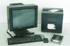
The historic NeXT computer used by Tim Berners-Lee in 1990, on display in the Microcosm exhibition at CERN. It was the first web server, hypermedia browser and web editor.

---
CERN, the European Organization for Nuclear Research, is where it all began in March 1989. A physicist, Tim Berners-Lee, wrote a proposal for information management showing how information could be transferred easily over the Internet by using hypertext, the now familiar point-and-click system of navigating through information. The following year, Robert Cailliau, a systems engineer, joined in and soon became its number one advocate.

The idea was to connect hypertext with the Internet and personal computers, thereby having a single information network to help CERN physicists share all the computer-stored information at the laboratory. Hypertext would enable users to browse easily between texts on web pages using links; The first examples were developed on NeXT computers.

Berners-Lee created a browser-editor with the goal of developing a tool to make the Web a creative space to share and edit information and build a common hypertext. What should they call this new browser: The Mine of Information? The Information Mesh? When they settled on a name in May 1990, it was the WorldWideWeb.

Info.cern.ch was the address of the world's first-ever web site and web server, running on a NeXT computer at CERN. The first web page address was http://info.cern.ch/hypertext/WWW/TheProject.html, which centred on information regarding the WWW project. Visitors could learn more about hypertext, technical details for creating their own webpage, and even an explanation on how to search the Web for information. There are no screenshots of this original page and, in any case, changes were made daily to the information available on the page as the WWW project developed. You may find a later copy (1992) on the World Wide Web Consortium website.

However, a website is like a telephone; if there's just one it's not much use. Berners-Lee's team needed to send out server and browser software. The NeXT systems however were far advanced over the computers people generally had at their disposal: a far less sophisticated piece of software was needed for distribution.

By spring of 1991, testing was underway on a universal line mode browser, which would be able to run on any computer or terminal. It was designed to work simply by typing commands. There was no mouse, no graphics, just plain text, but it allowed anyone with an Internet connection access to the information on the Web.

During 1991 servers appeared in other institutions in Europe and in December 1991, the first server outside the continent was installed in the US at SLAC (Stanford Linear Accelerator Center). By November 1992, there were 26 servers in the world, and by October 1993 the figure had increased to over 200 known web servers. In February 1993, the National Center for Supercomputing Applications (NCSA) in Chicago released the first version of Mosaic, which was to make the Web available to people using PCs and Apple Macintoshes.

... and the rest is Web history.

Although the Web's conception began as a tool to aid physicists answer tough questions about the Universe, today its usage applies to various aspects of the global community and affects our daily lives.

Today there are upwards of 80 million websites, with many more computers connected to the Internet, and hundreds of millions of users. If households nowadays want a computer, it is not to compute, but to go on the Web.

Monday, March 19, 2007

SmartWeb project to use P2P networks to keep drivers informed

Intelligent roadways are nothing new, as we've seen project after project (and even countries) look at varying ways to keep drivers informed whilst cruising about, but a new rendition showcased at CeBIT is looking to utilize P2P networking in order to spread pertinent information about road hazards to drivers behind the mishap. SmartWeb, which is being coordinated by the German Research Center for Artificial Intelligence along with a myriad of other corporations, would allow vehicles to detect hazards (such as an oil slick or road block) and pass the information on to surrounding vehicles in order to hopefully prevent accidents and give motorists ample time to locate a detour. This doesn't mark the first time P2P has been used for the betterment of mankind, and the data would reportedly be conveyed via a "dashboard screen or through a mobile handset," potentially adding yet another distraction to overload our brains while trying to remain between the blinking yellow lines. Of course, those of you with real-time traffic updates are already on top of the game, but we could definitely see this technology being marketable to thrill-seeking cops looking to pinpoint information feeds coming from speeding criminals.

-engadget
Related Posts Plugin for WordPress, Blogger...